
Creative Trends for Nutra Offers in Mid-2025
Blog » Creative Trends for Nutra Offers in Mid-2025
Among affiliate marketers, there’s a common belief that nutra is dying. In reality, nutra offers are still 🎯 actively being run in 2025. However, stricter moderation, banner blindness, and user distrust toward nutra products are pushing marketers to seek new solutions. And although the fundamental approaches haven’t changed much, the way ads are presented has evolved.
To achieve success now, webmasters are using the 👨💻 following tactics:
- More accompanying text in the ads;
- Use of tags;
- Packaging that resembles pharmaceutical products;
- Advertising on behalf of a reputable company;
- Attractive women, subtle hints of intimacy, appeals to masculinity — but without phallic symbolism.
Let’s take a closer look at each point with fresh examples.
More Text
Previously, most affiliates limited themselves to an image and one or two words. Now, more and more ads feature images accompanied by 📔 detailed text (sometimes quite lengthy). Here are a couple of telling examples.
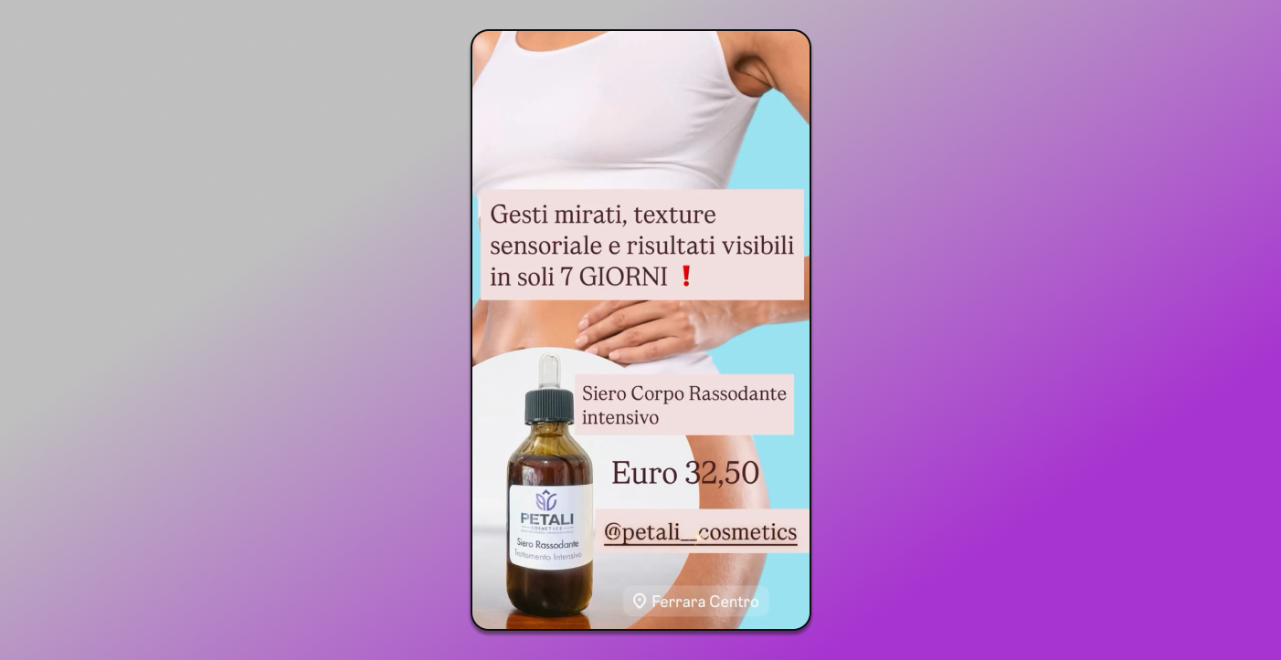
Text under creative: 🌿 Restores elasticity and fights stretch marks, enriched with a double concentration of collagen and elastin strengthening extracts. With added NMF moisturizing factors, it ensures proper hydration and immediate skin firmness recovery.
Enhanced with ginseng, aloe vera, centella asiatica, and echinacea extracts, it instantly halts aging processes and delivers a direct firming and elasticizing effect.
🫶❎ DERMATOLOGICALLY TESTED AND ALSO RECOMMENDED FOR PREVENTING STRETCH MARKS DURING PREGNANCY.
🌿 Targeted actions with exceptional results in just 7 days. Non-greasy, non-sticky, and suitable for use at any time of day. Strictly free from nickel and silicones. €32.50
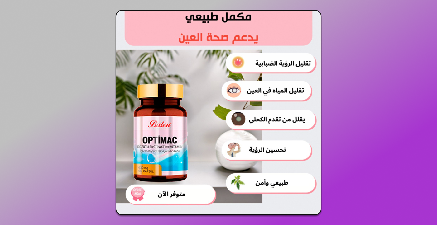
Ad Text: 18 natural ingredients to support eye health 🌿
Try Optimac now and experience immediate benefits for better vision: ✔️ Reduces watery eye discharge ✔️ Improves eyesight ✔️ Decreases blurry vision ✔️ Lowers light sensitivity ✔️ Protects eyes from strain
📝 The same bullet points appear on the image itself.
In our opinion, the reason for such detailed descriptions is the desire 🤏 to shorten the user journey from ad to purchase. As a result, we’re seeing fewer pre-landers telling transformation stories about weight loss, rejuvenation, or restored potency. This means the user must be motivated already at the ad-viewing stage.
Tags
Lately, tags have increasingly appeared in advertising creatives. They’re usually used when promoting somewhat well-known supplements.
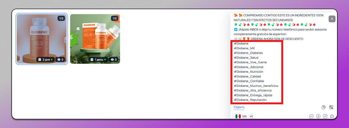
It’s likely that tags help a wider audience 🔎 discover the ad. For example, a user sees a post or an article mentioning Diobene with the corresponding tag. They click on the tag — and instantly see the ad.
Pharmaceutical-style packaging
This approach is common in products for joint support, diabetes, and other therapeutic purposes. Typically, such ads strike a balance between highlighting the product’s natural origin and presenting it as a 💊 pharmacy-grade medicine.
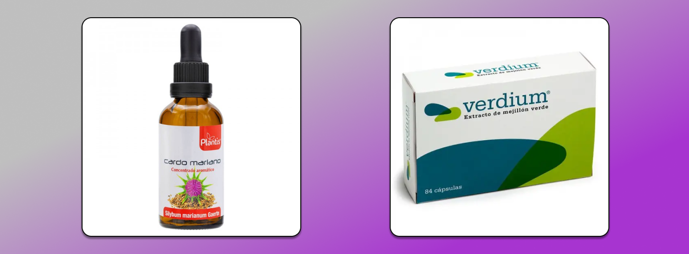
Ad Text: Green-lipped mussel – for joint health – Veridum – 84 capsules
🌿 Give your body everything it needs with ®Artesania Agricola – 100% NATURAL food supplements.
🌿 Treat your body to the best: essences, herbal extracts, oils, and more!
A trusted Spanish leader since 1975
🎁 Buy now with 100% FREE shipping on orders over 25 BGN!
A Serious Company with a Clean Reputation
Various slimming pills, creams, and anti-smoking remedies are already considered dubious products in the CIS — and even more so in the EU. As a result, advertisers are doing everything they can to “whiten” their reputation.
Previously, weight-loss and rejuvenation ads featured images of mysterious mixtures or homemade-looking remedies. Now, affiliates strive to present the product as 📋 certified and manufactured by a legitimate company. This effect is especially emphasized in health-related products.
In the example below, they even added social media icons — to imply that this is a real brand with an online presence, not just some shady business.

Translation (from Arabic): Capsules for diabetics. 39 capsules • 500 mg each
Some webmasters take it a step further and use logos of well-known pharmaceutical brands in their creatives.
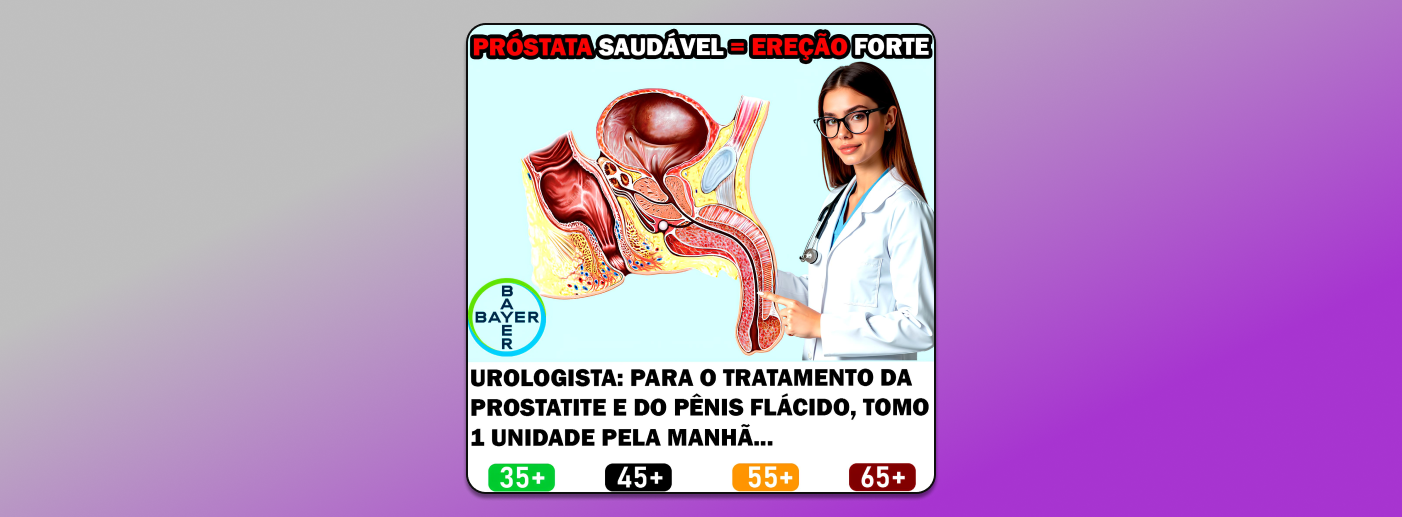
Translation: HEALTHY PROSTATE = STRONG ERECTION Urologist: “To treat prostatitis and a weak erection, I take one capsule every morning…”
This ad is accompanied by the following text beneath the image: “If you suffer from prostatitis or frequent urination — read this now ➡️ 🌿 Prostalis is a unique formula made with natural active ingredients and plant extracts that promote comfort and wellness.
It helps relieve discomfort, reduce bloating, and support overall well-being. Thanks to its carefully crafted blend of ingredients, Prostalis promotes a feeling of wellness after just one course of use. 🔥”
Hot Women
This applies to products for male enhancement and erectile support. In the past, ads for such products often featured bananas, cucumbers, or blurred phallic-like images. But with stricter Facebook moderation, even suggestive metaphors like these are being phased out. For example, Prostalis used a couple of different creatives — relying less on visual innuendos and more on attractive women, emotional appeal, and health messaging.

Translation: “For men only / Male supplement”
The text beneath the images was the same as in the previous example: “🌿 Prostalis is a unique formula made with natural active ingredients…”
Subtle Suggestion of Intimacy
Another approach used in advertising adult supplements is to depict a man and women together 💋 with a soft hint at sexual intimacy.
At the same time, the ad subtly plants the idea that sex can be intense and satisfying, so that the viewer understands this is an ad for a supplement — not a dating site.
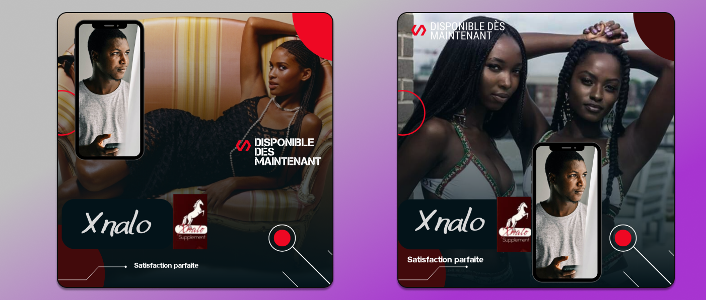
Translation: Perfect satisfaction. Available now.

Translation: Beautiful moments will last for hours
Text under the image:
Looking for natural support for comfort and confidence in intimate moments? Titan Gel is a natural topical formula used by thousands of people around the world as part of their skincare routine.
- It absorbs quickly and lasts long.
- For external use only.
- Safe and free from harmful ingredients.
📌 How to use: Apply a small amount as needed — gently massage and follow the instructions. 🧴
This product is intended for adults — use as part of your self-care routine.
Appeal to Masculinity
This also applies to male 🙋♂️ enhancement and erectile support products. Here, there’s often a subtle hint toward the penis (without direct visual representation or explicit phallic symbols), combined with suggestive text that appeals to the user’s sense of masculinity.

Translation: “A man is nothing without this.”
Text under the ad:
- 15% discount on Russian Titan Gel.
- Discounted price: 16 dinars instead of 25 dinars.
- Strength
- Hardness
- Enlargement
Guaranteed results with a money-back guarantee. Delivery available across all regions of the Kingdom.
Old-School Approaches Haven’t Gone Away
Although advertising is becoming less clickbaity and more native, classic approaches are still being used, especially in Africa, the Middle East, and Central Asia. For instance, the “Before and After” strategy is still commonly applied.
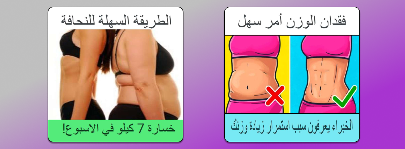
Translation: “A simple way to lose weight. Lose 7 kg in one week!”
The quality of such images is often far from ideal. And similar low-quality visuals are also used in ads for other nutra-related products.
On the other hand, it’s also common to use straightforward images that convey the product’s essence, accompanied by a short text underneath.

Ad text under the creative: “Cheaper and better than the gym 👌 BY DAY 7 YOUR PANTS WON’T BE TIGHT ANYMORE. THIS IS 💕💕💕 the most powerful product you can buy right now. 55% off for a limited release — directly from the manufacturer 🔥”.
In Conclusion
Summarizing the approaches above, it’s easy to see the general trend in nutra creatives:
- High-quality visuals — often with a premium feel, as if shot by a professional photographer.
- Clarity — visuals that instantly communicate the product’s purpose without the need for extra explanation. Understandably so — users don’t have time to scrutinize ads, so the message must be delivered immediately.
- Refined presentation — unrealistic promises are being toned down, phallic symbols are avoided, and the overall imagery is associated with cleanliness and a qualified, medical-like approach. Supporting text is provided to help the user quickly decide whether the product is relevant.
From all this, one clear conclusion follows:
👉 When creating nutra creatives, it’s best to draw inspiration from ads run by major supplement brands, online pharmacies, clinics, and beauty centers.
Such ads are, first of all, more likely to pass moderation, and secondly, they inspire more trust in the end consumer.